eeya design system
Friendly finance, made human.
A clear, welcoming system for everyday Namibians. Built around a confident logo, one expressive ribbon, and plain language.
Logo usage
Slate on light. Light or lime on slate. Keep it top-left, clear, and easy to read.
Slate on light
Light on slate
Lime on slate
Clear space and size
Keep clear space equal to one “e” loop on every side. Never use the logo smaller than 80 px on screen.
Minimum 80 px

Photography
Warm, real people in familiar places. Natural light and enough calm space for one short message.

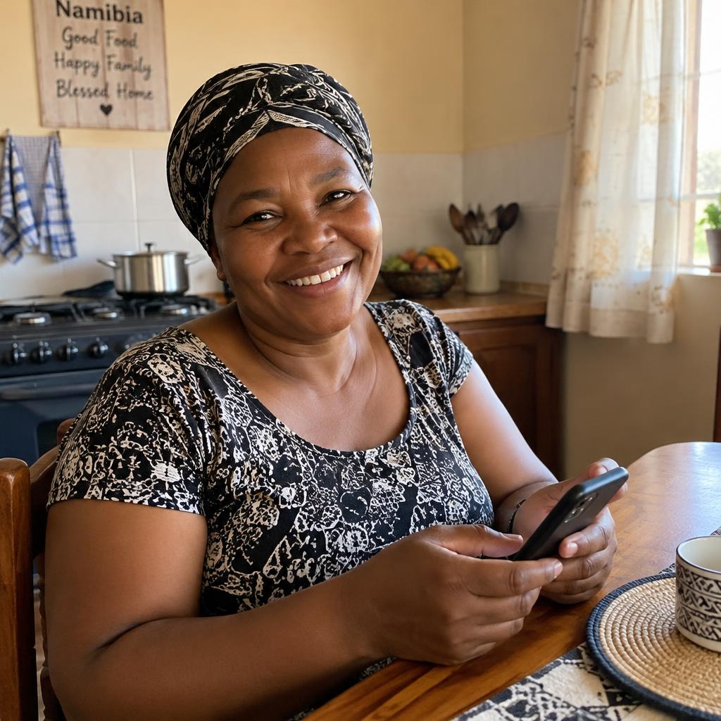
Everyday places, natural light, genuine expressions, and uncluttered backgrounds.
No office handshakes, piles of cash, heavy filters, or staged corporate scenes.
Applications
Use one ribbon, one short headline, and a single clear next step.
Cash for today, sorted by tonight.
A loan in a few taps.
Your debit order didn’t go through
We’ll try again on Friday. You can also pay now to avoid a late fee.
Brand rules
The non-negotiables. Keep these in mind for every piece.
- 01
Use only the brand tokens: slate, lime, mint, light, white and alert.
- 02
Never lime or mint text on light or white. Never white text on lime or mint — use slate.
- 03
Alert is for in-app warnings only, never marketing.
- 04
Manrope only, in Regular 400 and Bold 700.
- 05
Plain language, sentence case, one short headline per piece.
- 06
No gradients, outlines or drop shadows on brand shapes. Use flat panels and plenty of space.
- 07
Logo top-left, at least 80px wide. Never stretch or recolour it.
- 08
One ribbon per piece: a single flat lime or mint stroke, never over faces.